Functional role
Principal mobile designer
Scope
Smartphone & tablet design
Team
PM · External developers
Responsibility
End-to-end experience
Overview
Travelocity, an online travel agency owned by Expedia Group, undertook a redesign its mobile app and create a tablet version. As principal designer, I worked with a project manager and external developers to deliver a streamlined, user-friendly experience across devices, improving navigation and booking flows.
Problem
The existing app was built without UX input, visually dated and difficult to use, with excessive content and poor readability across mobile and tablet.
Approach
Started with a content audit and competitor analysis, then redesigned mobile-first before adapting to tablet.
01
Brand alignment
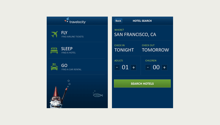
Used the gnome as a journey companion, not just a mascot - placing it at key moments throughout the search flow.
02
Flash-to-detail-cards
Price, times and stops at a glance - expanding inline to reveal connection details without leaving the results page.
03
Persistent search bar
Consolidated all search inputs into a single persistent bar - letting users edit destination, dates and guests from anywhere without starting over.
As the sole designer, I defined the UX direction from scratch - replacing a developer-built product with a design-led experience across mobile and tablet.
Shipped in three months, the redesign was adopted across the organization including the web team, and launched to high initial ratings. It established the design foundation Travelocity scaled from.
Design highlights